From inline-block to CSS Grid
CSS tutorial: how to rewrite an inline-block layout in CSS Grid.
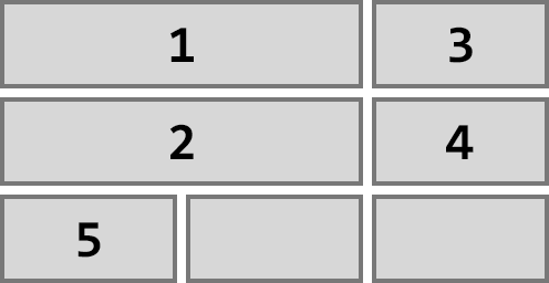
I rewrote my homepage navigation using CSS Grid. Here’s what the navigation should look like:
- Card navigation
- 4 columns grid
- Cards have fixed width and height
- Some cards are twice as wide
- There is an even gap between the cards
- Cards must flow left-to-right, top-to-bottom
- The grid must be horizontally centered—but not the cards within the grid!
- The grid must be responsive and reflow according to screen size.
Inline-block
The previous solution was based on inline-block, which does the job across all browsers, but at a price:
- The width of the card that is twice as wide must be set manually according to the margin between the cards.
- If the margin between the cards is modified, the width of the large card must be modified as well.
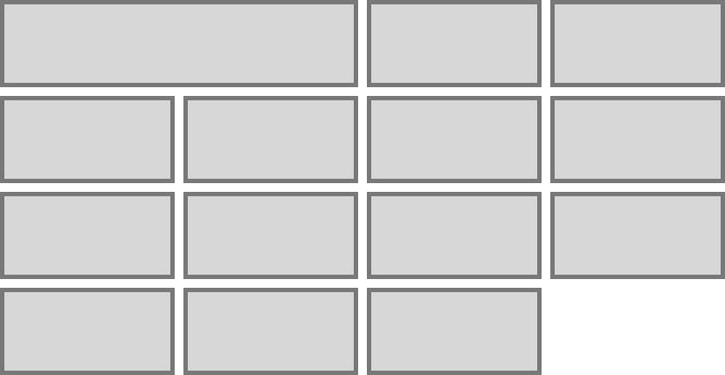
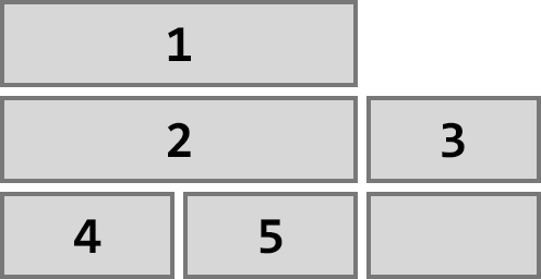
- In order to center the grid, we could set
text-align: centeron the grid container. But that would center all cards as in the illustration above. - In order to get a proper centering, the grid container is set to
text-align: leftandmargin: auto. Then, the width of the container is set manually at several breakpoints using media queries. - If the size of the cards or their margin is modified, the width of the container at all the breakpoints must be reset.
Here’s the inline-block CSS for a given set of grid dimensions:
.nav{
    max-width: 1232px;
    margin: auto;
}

.nav_item{
    display: inline-block;
    vertical-align: top;
    width: 300px;
    height: 150px;
    margin: 4px;
}

@media screen and (min-width: 633px){
    .nav_item.large{
        width: 608px;
    }
}

@media screen and (max-width: 1264px){
    .nav{
        max-width: 924px;
    }
}

@media screen and (max-width: 964px){
    .nav{
        max-width: 616px;
    }
}

@media screen and (max-width: 632px){
    .nav{
        max-width: 308px;
    }
}
Notice the multiple hard coded numbers in the code. Using inline-block gets the job done but requires significant maintenance.
Another drawback of inline-block is that it’s sensitive to white space in markup. White spaces, including line breaks, translate into margins between elements. My cards in HTML had to be written like this:
<a class="nav_item" href="/blog/">
    <h1>Notes</h1>
</a><a class="nav_item" href="/backspace-mirror/">
    <h1>Backspace Mirror</h1>
</a>
Notice how the a elements are kept adjacent in the markup to avoid white space. This makes the markup less readable, and manipulation of blocks of code more tedious.
CSS Grid
Let’s start fresh and rewrite everything in CSS Grid.
Here’s the HTML:
<nav class="nav">
    <a class="nav_item large" href=""></a>
    <a class="nav_item" href=""></a>
    <a class="nav_item" href=""></a>
    <!-- ... -->
</nav>
Here’s the CSS:
.nav{
    display: grid;
    max-width: 1224px;
    margin: auto;
    padding: 8px;
    grid-template-columns: repeat(auto-fit, 300px);
    grid-auto-rows: minmax(150px, auto);
    grid-gap: 8px;
    justify-content: center;
}

@media screen and (min-width: 641px){
    .nav_item.large{
        grid-column: span 2;
    }
}
grid-template-columns: repeat(auto-fit, 300px) means that the grid must fit as many columns of exactly 300 pixels as possible. This makes the grid automatically responsive. More or less columns will be fitted depending on the container’s width.
grid-auto-rows: minmax(150px, auto) means that each row is at least 150 pixels tall, and can stretch to accommodate taller content.
grid-gap: 8px means that there must be 8 pixels between the grid items. Note that grip-gap applies only to the inner gutter. No gap will be added between the grid items and the edges of the grid. That’s why a padding: 8px is added to the grid container.
max-width: 1224px tells the grid to stop at 4 columns. That value is equal to 4*300px + 3*8px (the 3 inner gaps) = 1224px.
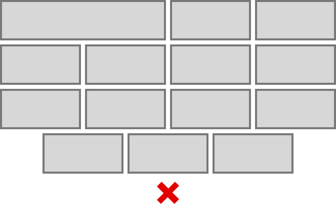
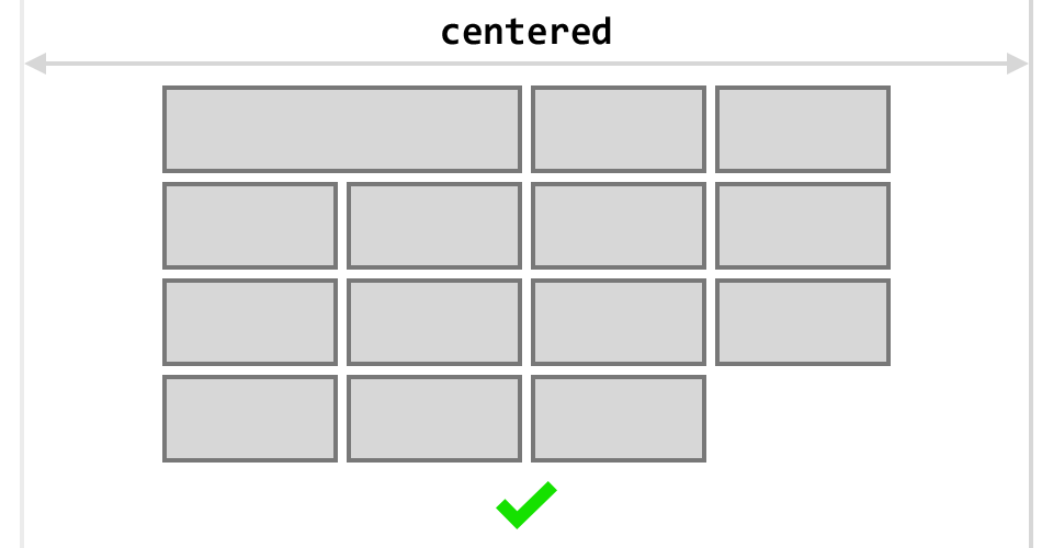
justify-center: center tells the grid to center its items along the row axis, which means horizontally centered in this example. Note that the automatic flow of CSS Grid maintains the left-to-right placement of the items in a row. The last items won’t be centered relatively to the grid if there aren’t enough items to fill a row:
Finally, we add the large card code for bigger screens inside a media query. The value span 2 of the property grid-column tells the large card to span across 2 column, no matter the width of the columns or the gap between them.
And we’re done! This setup is enough to get the main grid up and running on all screen sizes!
A step further
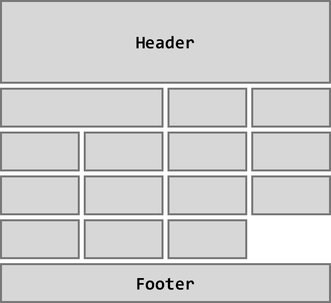
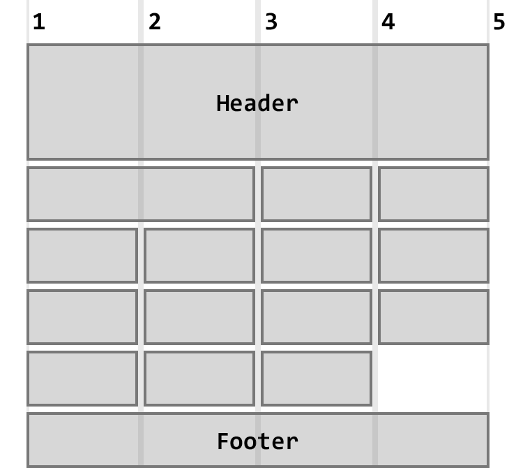
Let’s take this a step further and rewrite all the homepage in CSS Grid.
Here’s the layout I’m aiming for:
Here’s the HTML:
<main class="main">
    <header class="header"></header>
    <nav class="nav">
        <a class="nav_item large" href=""></a>
        <a class="nav_item" href=""></a>
        <a class="nav_item" href=""></a>
        <!-- ... -->
    </nav>
    <footer class="footer"></footer>
</main>
Here’s the CSS:
.main{
    display: grid;
    padding: 0 8px;
    grid-template-columns: repeat(auto-fit, 300px);
    justify-content: center;
    grid-gap: 8px;
}

.header{
    grid-column: 1/5;
}

.nav{
    grid-column: 1/5;
    display: grid;
    grid-template-columns: repeat(auto-fit, 300px);
    grid-auto-rows: minmax(150px, auto);
    grid-gap: 8px;
    justify-content: center;
}

.footer{
    grid-column: 1/5;
}

@media screen and (min-width: 641px){
    .nav_item.large{
        grid-column: span 2;
    }
}
An interesting behavior is emerging from this setup: did you notice that we no longer specify a max-width or a margin: auto on any container? Yet, the grid stays centered with a maximum of 4 columns as intended. This is the result of the grid-column property.
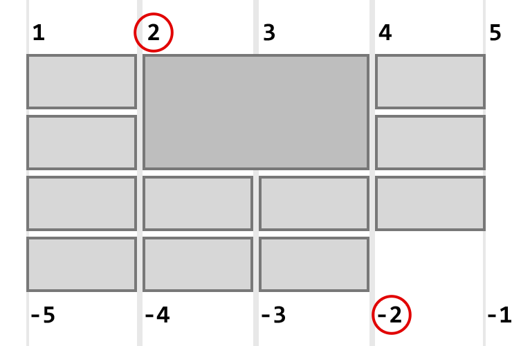
grid-column: 1 / 5 means that the element must span horizontally from the first vertical line of the grid to the fifth vertical line of the grid. Those numbers were confusing to me until I accepted that they represent lines, not columns:
The first line is the left-most edge of the grid. The fifth line is the line after the fourth column. So 1/5 translates to 4 columns. Therefore the grid will accommodate 4 horizontal cards at most, and then automatically reflow on a new row. In conjunction with justify-content: center, this effectively removes the need to specify the container’s width! That’s a nice emergent behavior!
Benefits
What did I get from rewriting the homepage in CSS Grid?
Compared to the inline-block implementation, I get the same visual layout with fewer lines of code and quicker iteration on the grid parameters.
I also get new options that I couldn’t consider before.
For example, the fact that the large card was defined as twice as large as the regular ones was a product of the limitations of the previous code. I couldn’t get a card that was twice as tall without significant hacking. But with CSS Grid, I could write:
.nav_item.tall{
    grid-row: span 2;
}
And the card would be twice as tall as the others:
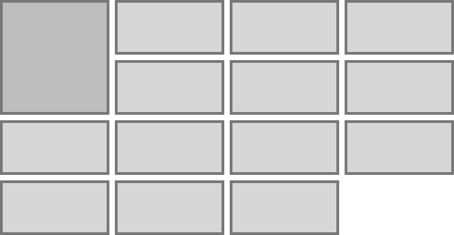
Another interesting case: what if I have 2 large cards, but the screen can only accommodate 3 columns? I would have a gap in the grid like this:
But if I set grid-auto-flow: dense on the grid container, I get this:
CSS Grid automatically fills in the available space by reflowing the cards. Nice!
Here’s another feature. We can write:
.nav_item.nested{
    grid-column: 2 / -2;
    grid-row: span 2;
}
And we get this large nested card:
grid-column: 2 / -2 tells the element to start after the second line of the grid, and to end before the second line of the grid, counting from the right! The negative value -2 is indeed the second line of the grid, but from the right edge of the grid.
This means that the element always has one column on its left and on its right, no matter the total number of columns. If the screen cannot accommodate a minimum of 3 columns in total, the auto placement algorithm will kick in, and we can use media queries to be more specific.
Browser support
The downside of CSS Grid is browser support. All major western browsers support CSS Grid. But older versions of these browsers do not. CSS Grid doesn’t work on Internet Explorer or Mobile Safari on iOS 10.2 and below.
The layout I implemented is grid-dependent. There needs to be a full alternative for other browsers.
I see 3 options:
- CSS override: write cross browser CSS rules first, then add CSS Grid rules for compatible browsers.
- Feature queries: use
@supports (display: grid)to target compatible browsers, or@supports not (display: grid)to target older ones. This is the cleaner version of CSS override. - Javascript: test CSS Grid support with Javascript, and load a fallback stylesheet if needed. This is the Javascript version of feature queries.
Since I decided to make CSS Grid the default implementation, I’ll add legacy code only when CSS Grid is not supported, and drop legacy code as soon as possible. Therefore I need to test for non support of CSS Grid. Feature queries are not supported in Internet Explorer, so I’ll use Javascript.
Here’s the code:
if(!('grid' in document.body.style)){
    var fallback = '<link rel="stylesheet" type="text/css" href="fallback.css">';
    document.head.insertAdjacentHTML('beforeend', fallback);
}
We test for CSS Grid support programmatically, and if it’s not supported, we include a fallback stylesheet. Which CSS fallback solution to use depends on the project and audience. In my case, I fall back to Flexbox combined with media queries.
Links
- Homepage, and the fallback stylesheet. The fallback uses a combination of Flexbox and media queries.
- Sara Soueidan, “auto-fill” vs “auto-fit”, 2017.
- Benjamin De Cock, CSS Grid In Production (YouTube), 2017. I used the Javascript fallback solution suggested by Benjamin.
- Aaron Gustafson, The Story of CSS Grid, from Its Creators, 2017.